
Did you know that February is Low Vision Awareness Month in North America? Every year in February, researchers, optometrists, and ophthalmologists across the continent advocate for resources and rehabilitation services for people with low vision.
What is Low Vision?
Low vision refers to vision-related conditions that are incurable with glasses, contacts, medicine, or surgery. These conditions impair daily activities such as reading, driving, and recognizing faces, and significantly impact not just the quality of life, but the safety and comfort of patients.
Some common causes of low vision include:
- Inherited diseases or conditions
- Glaucoma
- Cataracts
- Brain or eye-related injury or trauma
For those affected by low vision symptoms, it is crucial for us to provide resources and services that can help them maximize their remaining sight and help them lead more comfortable lives. In the modern age where we migrate to paperless, digital methods to distribute information, there are many principal considerations to keep in mind.
Accessibility Considerations
When we think of digital accessibility, visual accessibility is often the first thing we think of. However, what does it actually mean to be visually accessible? We compiled a list of key points and strategies to implement when designing digital products such as websites and mobile apps in order to help low-vision individuals navigate, process, and interact with visual information.
- Alt Text: Alt text, or alternative text, is a brief sentence that describes a non-textual piece of content, such as an image. If an individual with vision impairments uses a screen reader, alt text will be read aloud, effectively conveying the meaning and context of multimedia content on the screen. You can read more about how alt text improves digital accessibility in our blog post here.
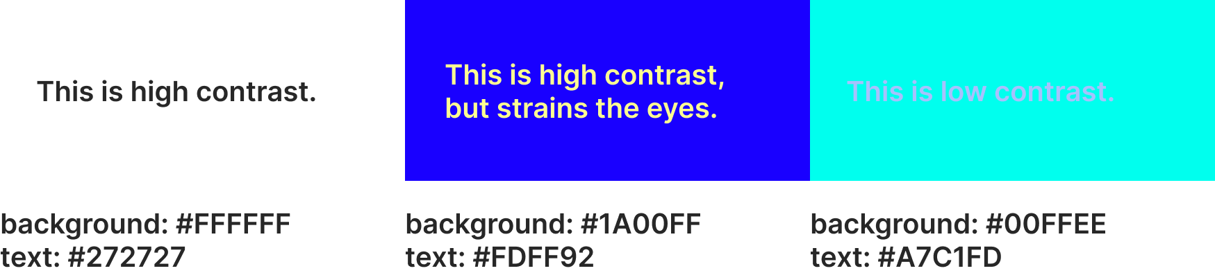
- Color Contrast: Color contrast refers to the difference in brightness between two colors. If two colors have low color contrast, it means that they look very similar and may be hard to distinguish for those with visual impairments or color blindness. High color contrast should be used, such as darker colored text on a light background. However, contrast that is too high, such as between two complementary neon colors, should also be avoided as it is hard on the eyes and causes readability issues. We’ve included an example of low color contrast and high color contrast below for comparison:
- Font: Font size may be the most intuitive component of digital accessibility, and the easiest to implement or change. For a regular body of text, a font size of at least 12pt (16px) is generally recommended. However, there are other aspects to consider as well. For instance, you should pick a font that is clean and easy to read, and you should make sure that your typography is consistent throughout your web or mobile application. In addition, you should be mindful of inline spacing and letter-spacing to prevent words and lines of text from looking too cramped, though these spacing settings are often configured automatically to prevent these issues.
- HTML Structure: One detail that is most likely to be overlooked is the overall semantic structure of your digital application. For non-technical designers, this may be a challenge as they may be unfamiliar with proper HTML syntax, and the versatility of HTML may cause improper tags and attributes to be used or omitted altogether. For example, a heading may be coded as a regular box of text with a large font. However, HTML has built-in heading elements, such as H1, H2, and H3, that should be used as they will be differentiated from the text body when being read by a screen reader, and they have default sizes that are typically used in most webpages. Moreover, since the alt text attribute is optional, developers may forget to include alt text when building the webpage, causing users who rely on screen readers to miss out on important information.
How YuJa Products Enhance Visual Accessibility
There are many aspects in addition to the ones mentioned above that may impact the accessibility and usability of a digital application. Several of YuJa’s core products, such as the YuJa Panorama LMS Accessibility Platform and the YuJa EqualGround Accessibility Governance Platform use vigorous scanning capabilities to compare the contents of a webpage to established standards like the Web Content Accessibility Guidelines (WCAG). Not only do these tools notify users when their content needs improvement, they make real-time remediation suggestions that can be applied with a simple click. As technology continues to advance, digital accessibility remains a key consideration in the design and development process.
Protect Your Eyes!
Eye health is pivotal to our overall wellbeing and provides us access to see many wonders. In order to protect our vision, we cannot solely rely on technological strategies. Having routine eye exams, maintaining a healthy diet, and wearing protective eye equipment are all methods to prevent vision loss and eye-related injuries. Don’t forget to rest your eyes and take a break from the screen after reading this blog!